Case Study
Big Island Booch Kombucha
A long-term brand partnership supporting growth from local favorite to a leading regional brand.
Introduction
Big Island Booch is a Hawaii-based beverage company specializing in kombucha and jün and known for its tropical flavors, local sourcing, and vibrant brand personality.
When we began working together in 2016, the brand was at a pivotal moment—preparing for organic certification, expanding production, and positioning itself for increased retail visibility.
Before Our Collaboration
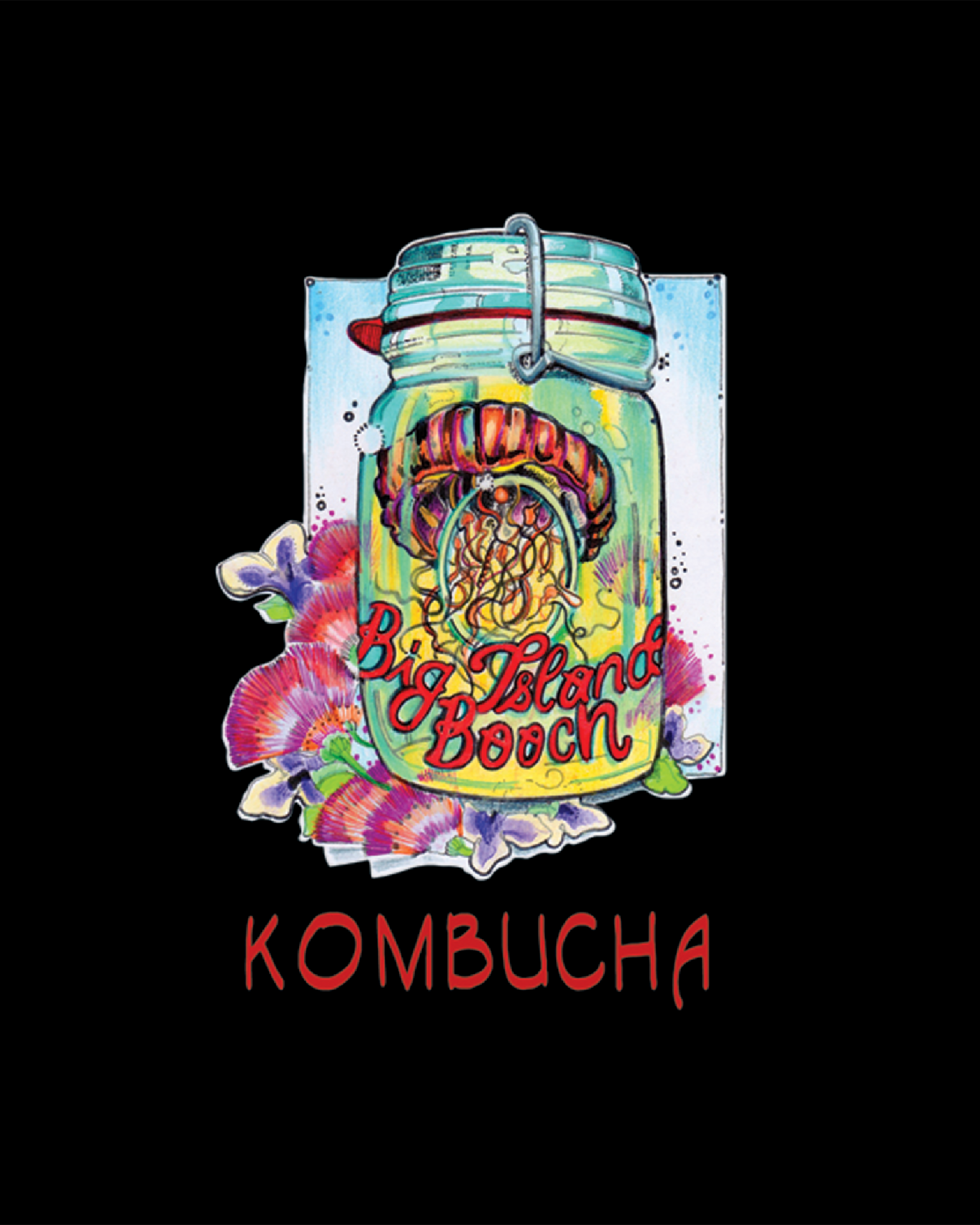
Big Island Booch relied on a hand-drawn logo featuring a tattoo-style scoby illustration, and packaged their products in salad-dressing style bottles.
While charming and well-loved locally, their main competitors on store shelves were imported national brands, and their packaging lacked the professional standards needed to compete with them.
The brand was preparing for growth into new markets and needed a visual identity that could scale without losing its origin story.
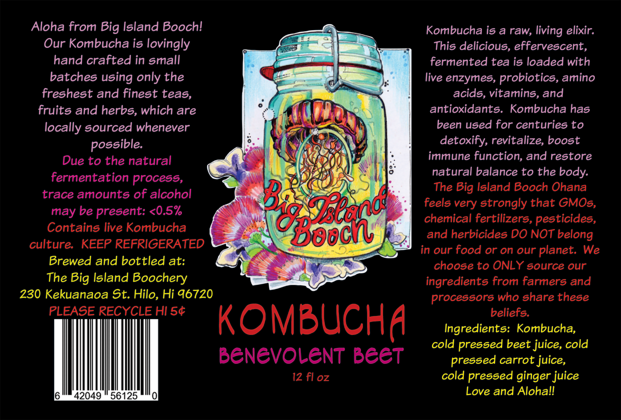
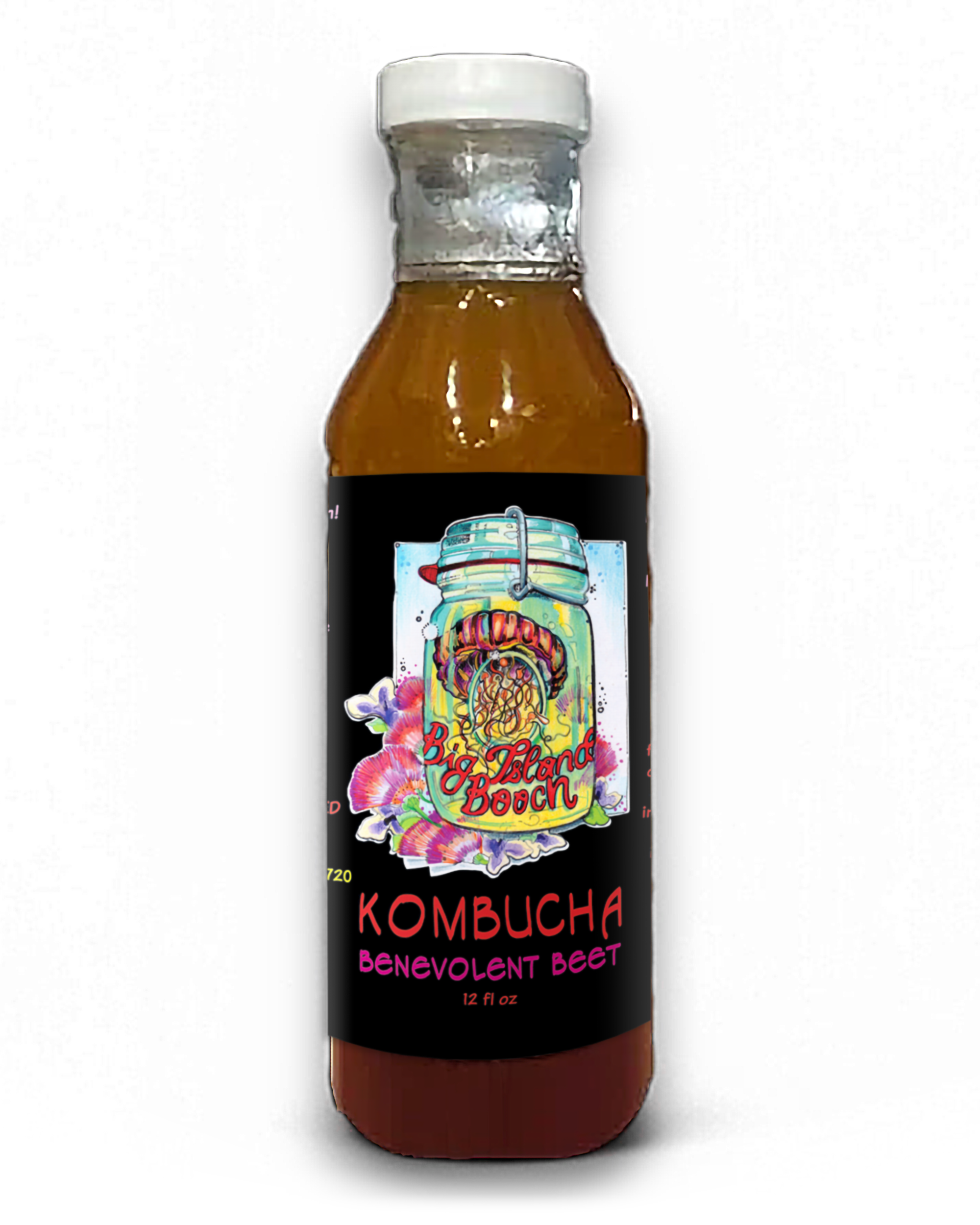
The original brand and label art:
“We started out as a super grassroots company, hand-making our products and using a hand drawn, colorful label that was a nightmare to print, was not clear from 10 feet away and it was not obvious what was even in the bottle!”
The Challenge
The company needed a brand identity that:
• Matched or exceeded the polish of national competitors
• Retained the loyalty of their local following
• Established a strong shelf presence statewide
• Supported growth into Costco and other major retailers
• Could scale across bottles, cans, merch, digital assets, and future product lines
“Our product really ‘grew up’ when we started working with Ryan.”
Strategic Approach
To build a brand capable of competing at a national level while preserving its personality and Hawaiian authenticity, I began with in-store research of category leaders and direct competitors.
This helped identify both visual conventions within the kombucha category and opportunities for differentiation.
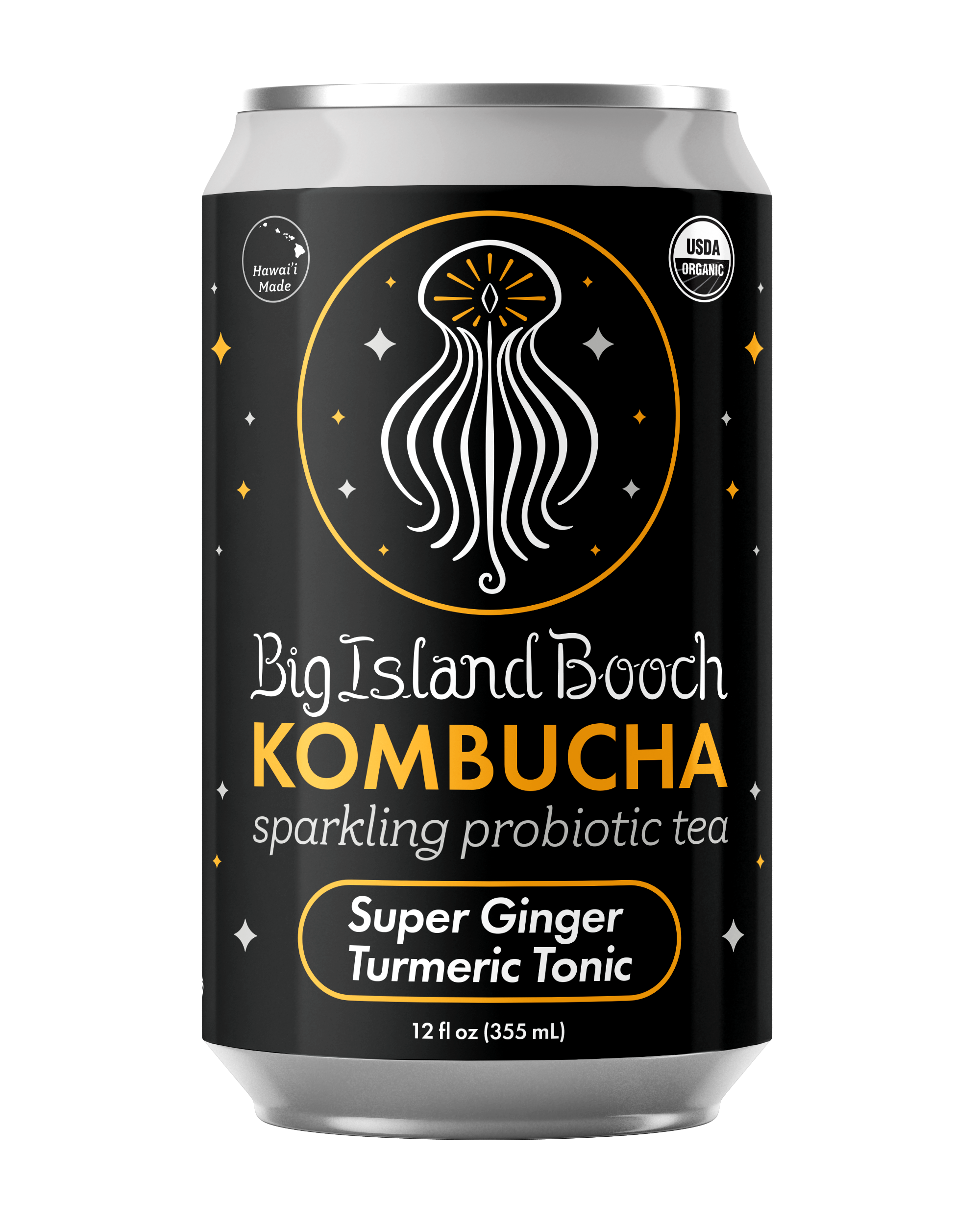
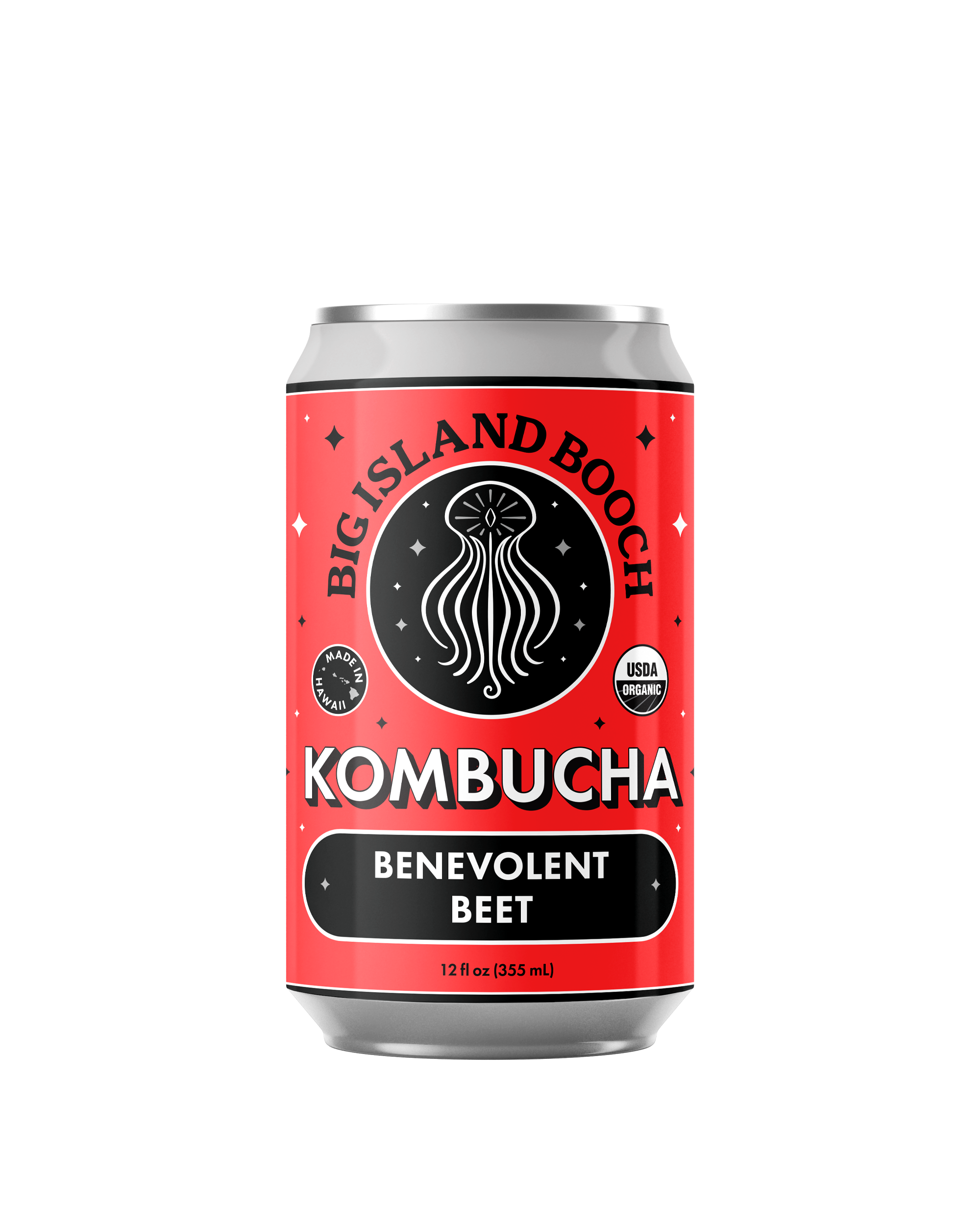
What emerged was a clear direction rooted in Big Island Booch’s existing identity—bold, energetic, and expressive—rather than a departure from it. The brand’s visual language was refined and structured, drawing inspiration from tattoo culture, mandalas, and symbolic forms, while introducing a level of polish necessary for broader retail environments.
Design decisions were made with scalability in mind, ensuring the system could extend beyond a single label or format and support future growth across products and channels.
Guiding decisions set the foundation for a flexible system that could adapt as the business expanded.
• Establishing black-dominant branding to stand apart from competitors’ bright, white-heavy packaging
• Refining the original illustrated mascot into a geometric logo with greater balance and clarity
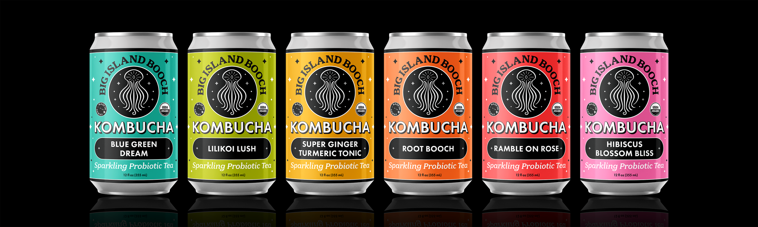
• Introducing metallic labels with revealed accents to add depth and shelf impact
• Designing a custom “Made in Hawaii” insignia to emphasize their edge over imported products
• Creating a flavor-forward color system that scales fluidly across products
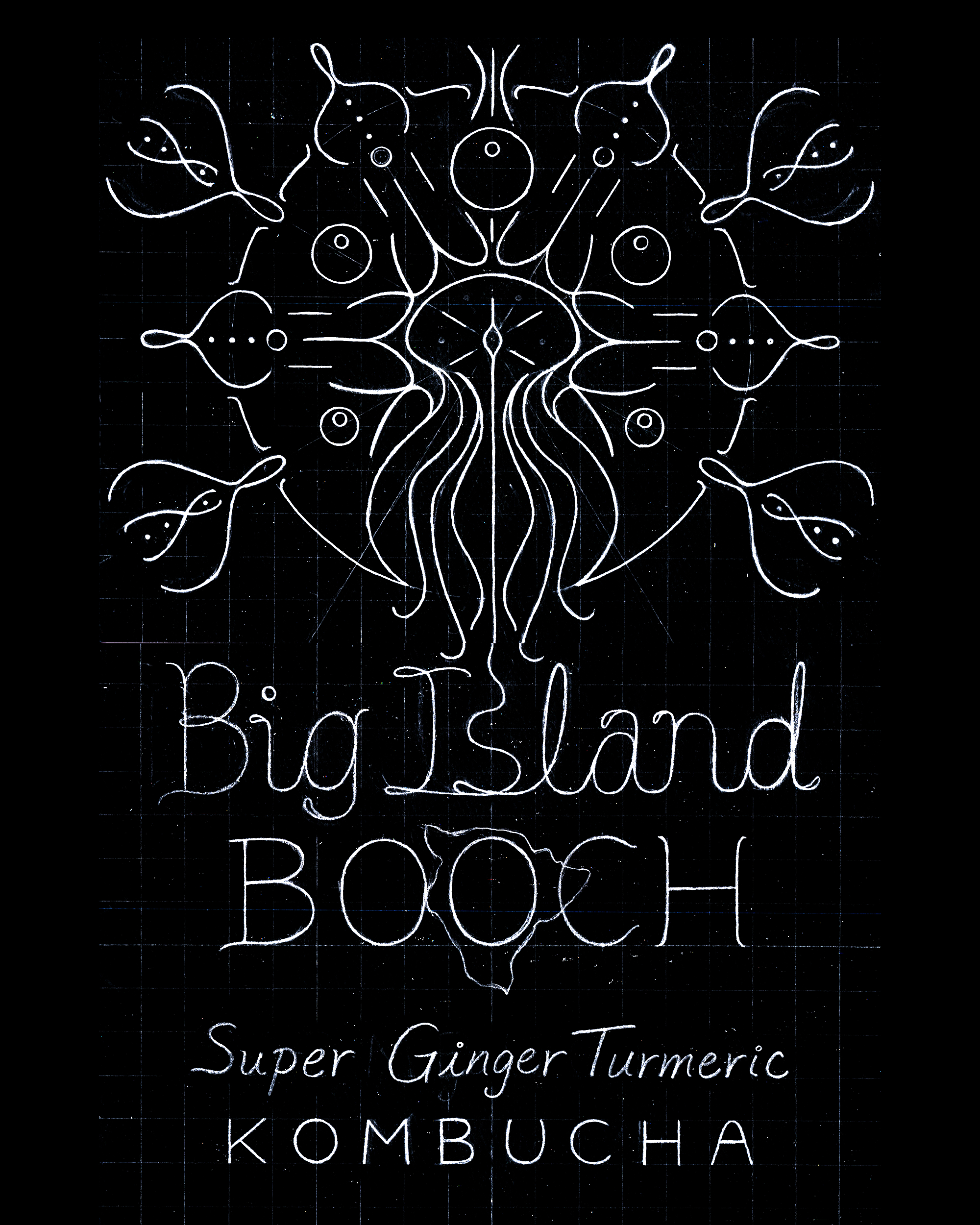
Initial sketch for the logo (2016)
Early edition of the logo (2018)
Current logo (2025)
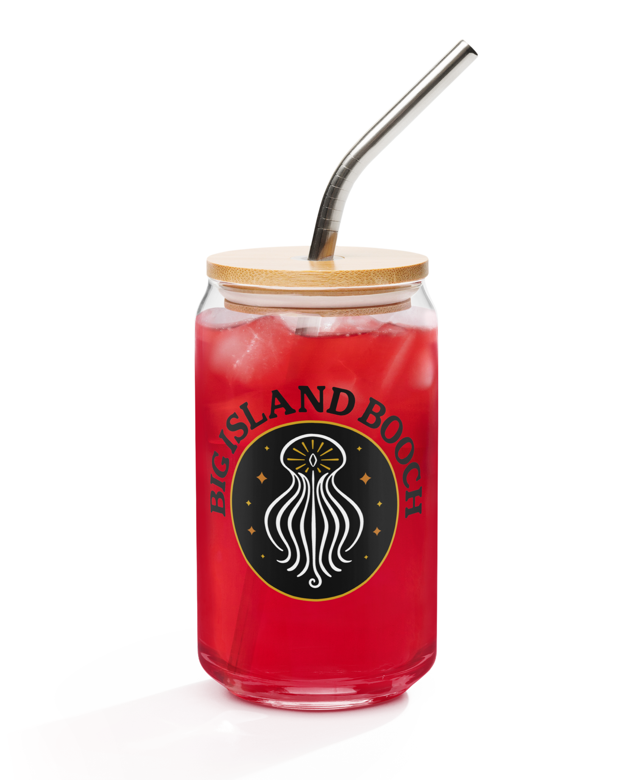
First edition can art (2022)
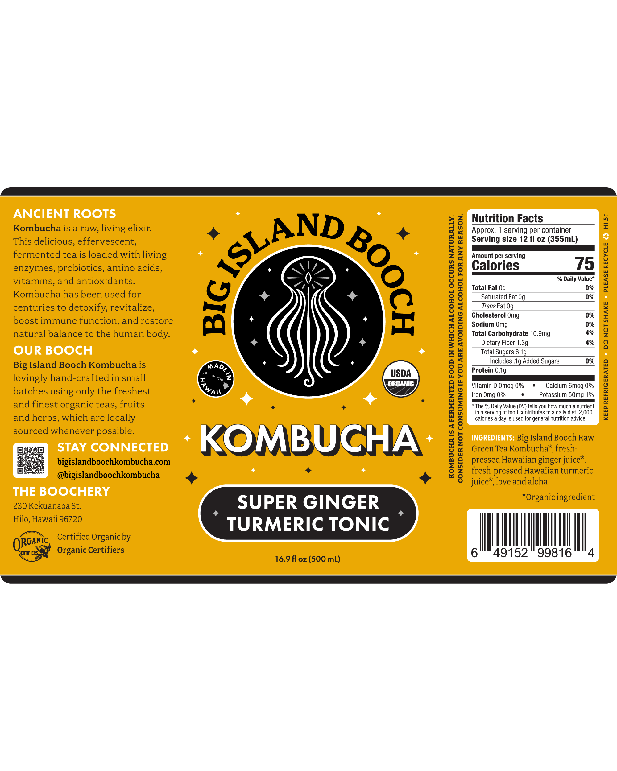
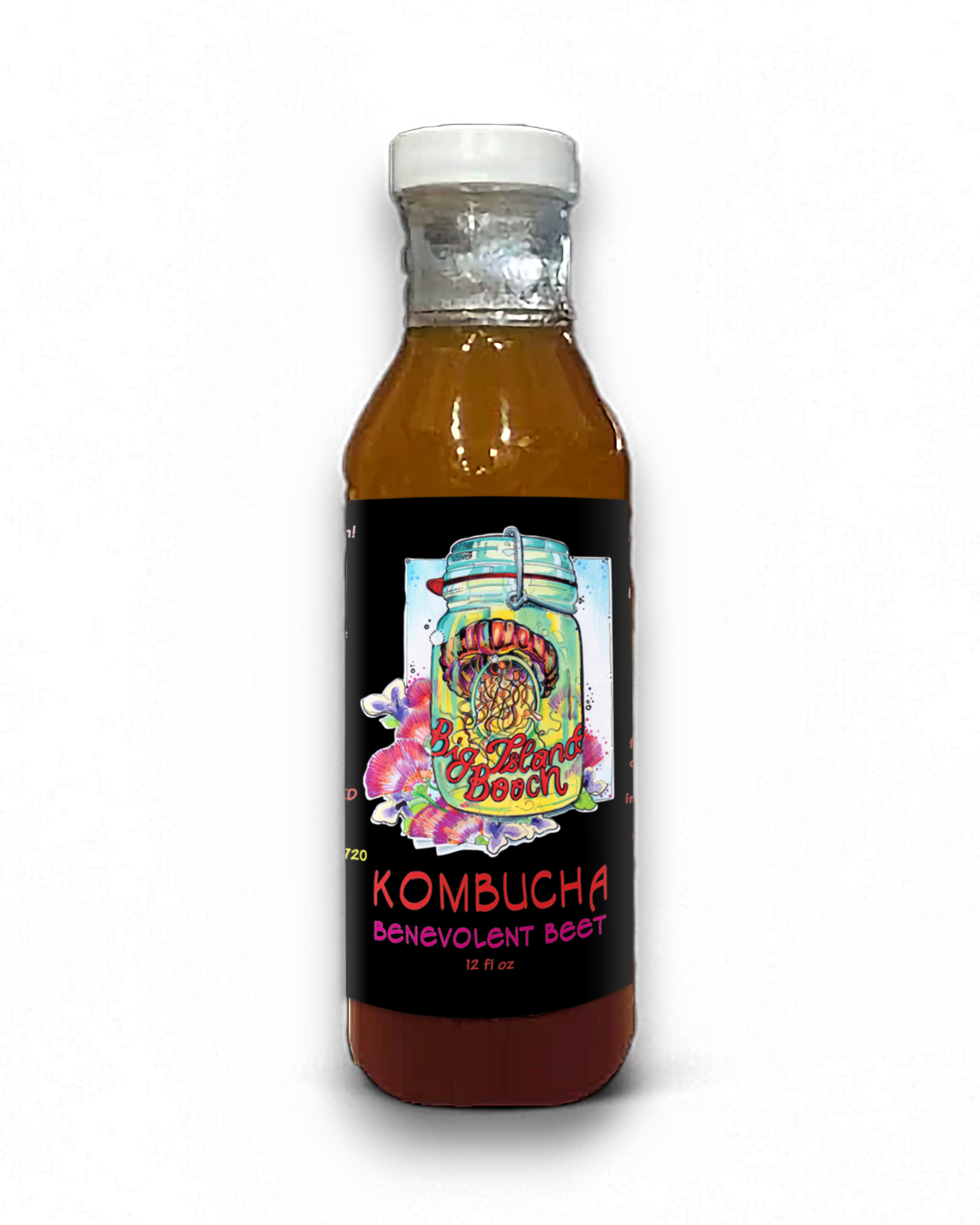
Current label (2025)
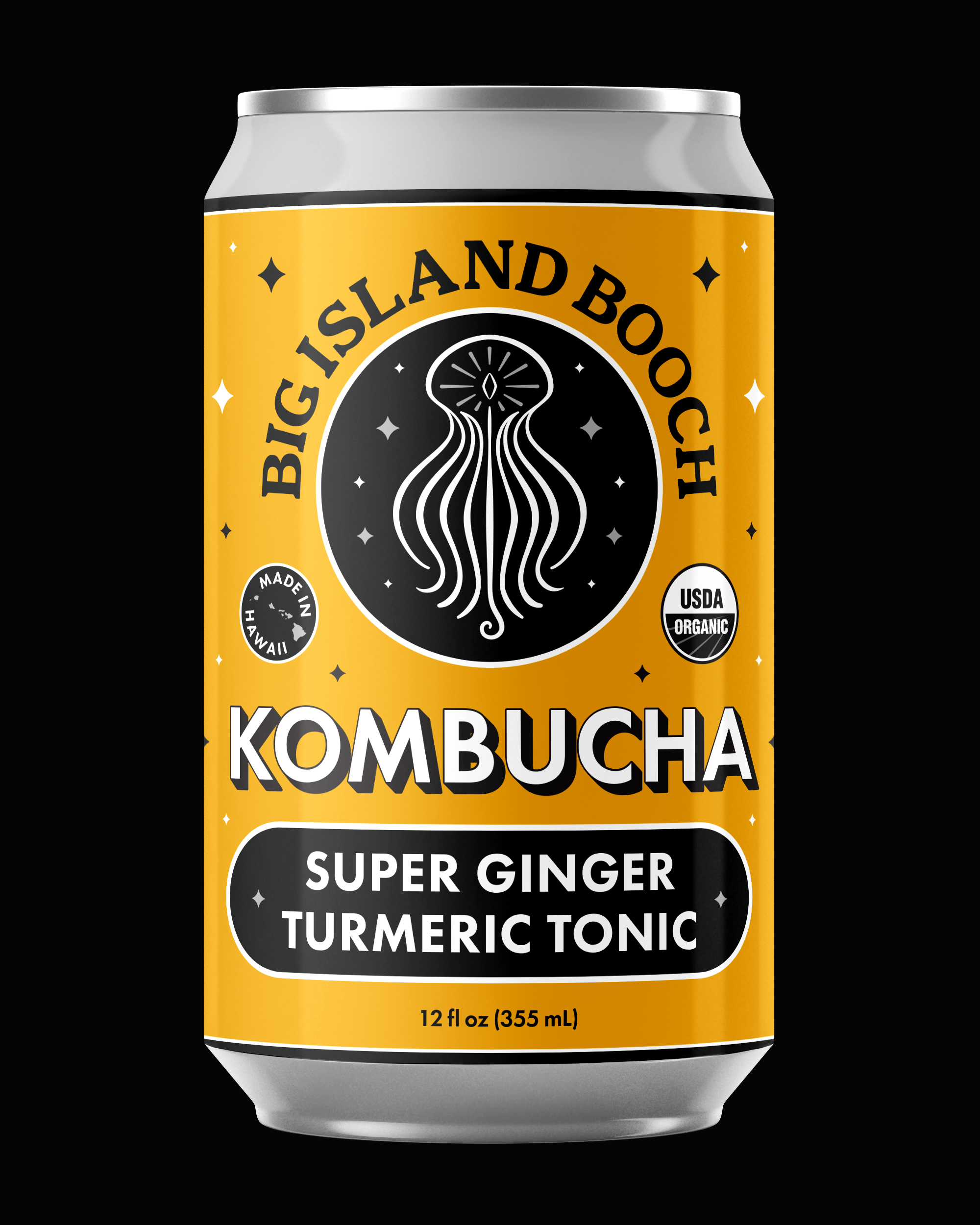
Current can art (2025)
“He was able to take the elements of the old logo and reimagine it into something that was clean, simple, recognizable and still captured the elements of the old logo that were important to us.”
Implementation and Brand System
Over the course of more than eight years, the Big Island Booch brand has expanded well beyond its original packaging. As the company grew, I developed and managed a complete visual ecosystem designed to support new products, formats, and environments while maintaining continuity.
Rather than treating each new initiative as a standalone project, the brand system was applied and adapted across every touchpoint—allowing the identity to evolve without losing recognition or coherence.
This work included:
• Packaging for all kombucha bottles and cans
• Packaging for jün beverage cans
• Full identity development for Big Island Brew (coffee)
• Costco growlers and six-pack boxes
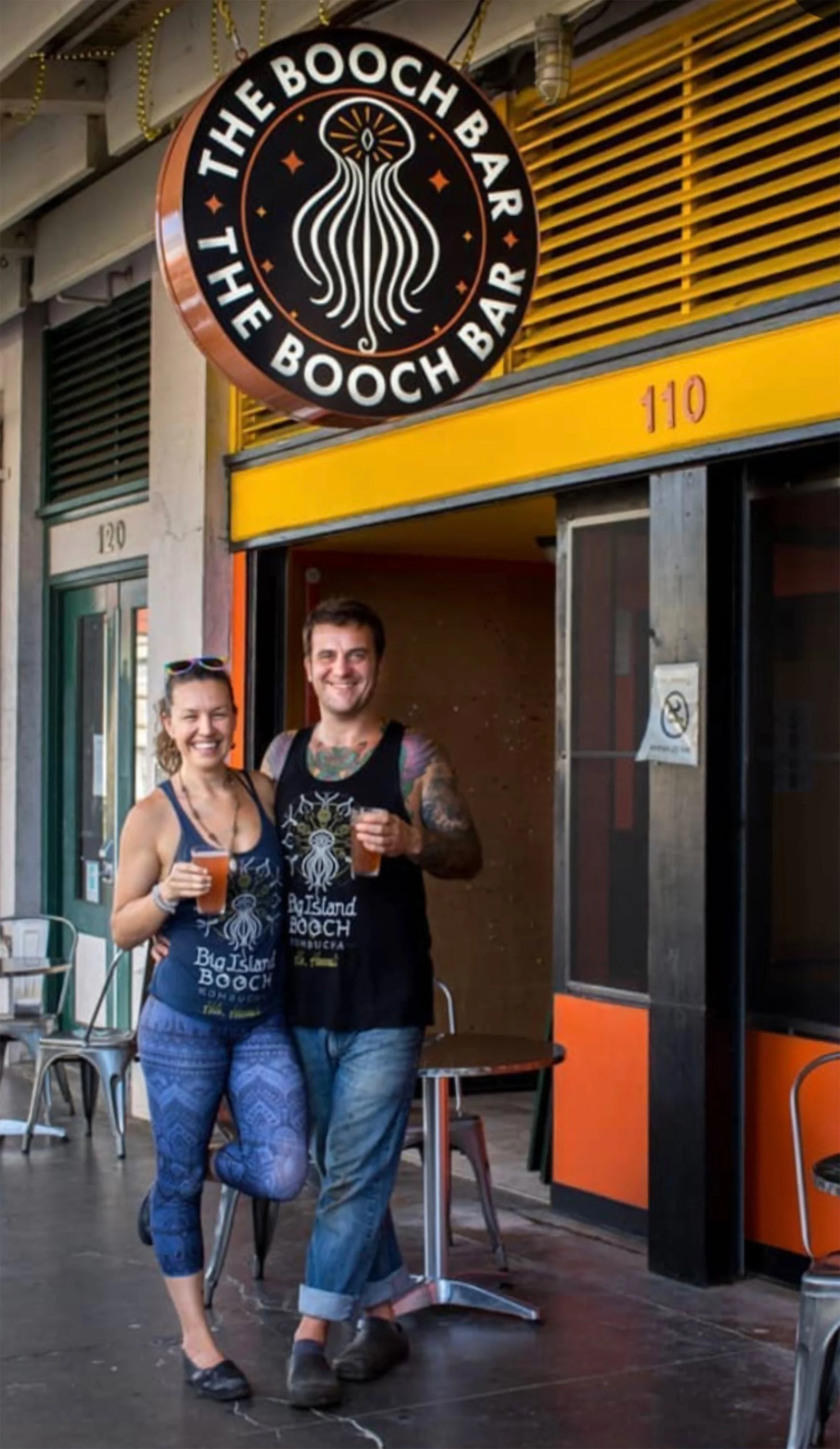
• Signage, menus, apparel, and tap handles for The Booch Bar
• Website design
• Print production coordination and quality control
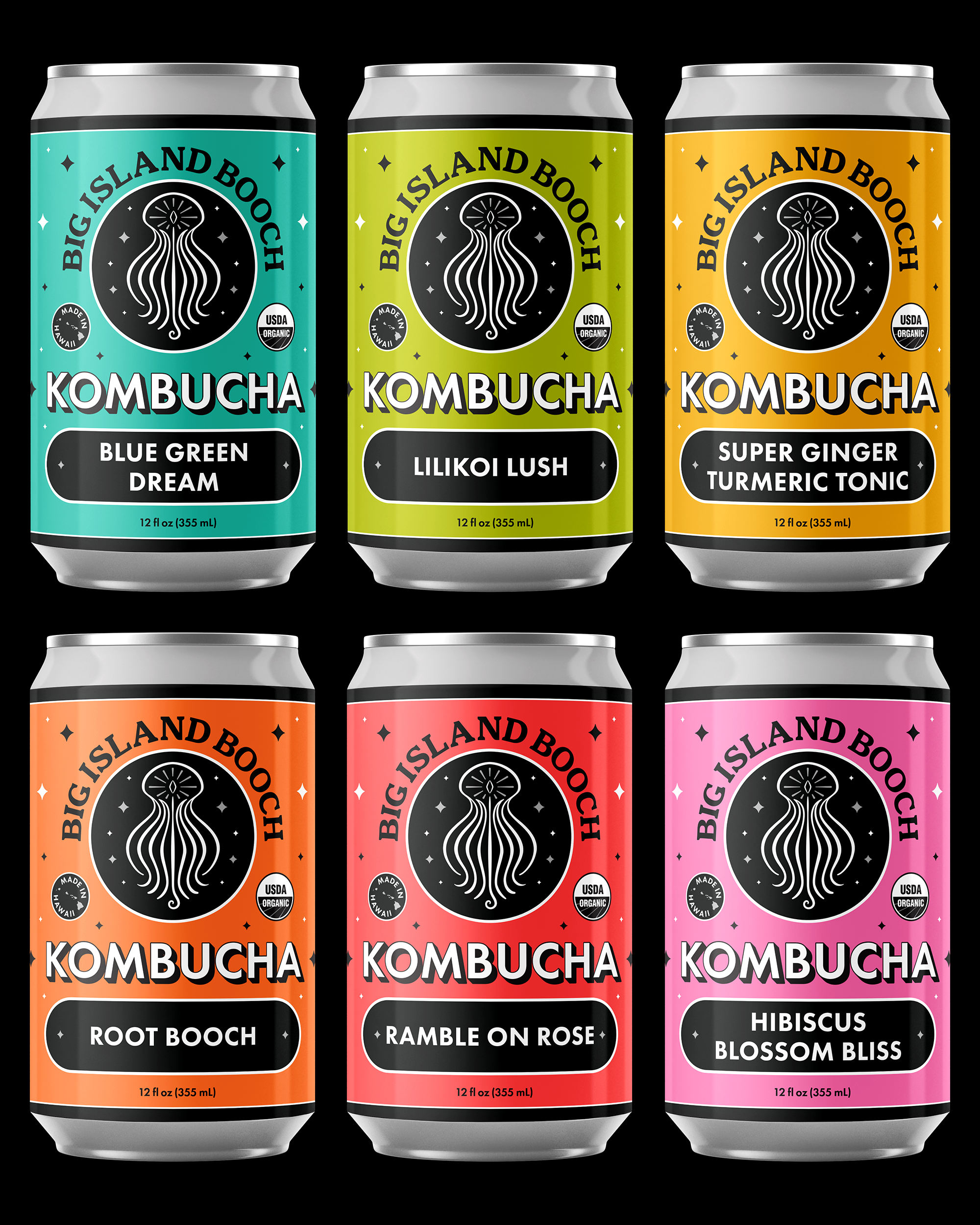
Big Island Booch Kombucha (2025)
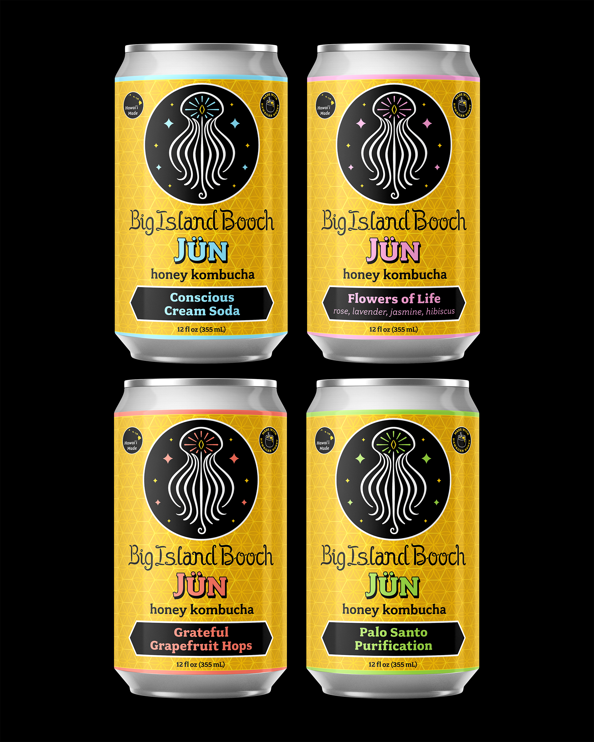
Big Island Booch Jün (2023)
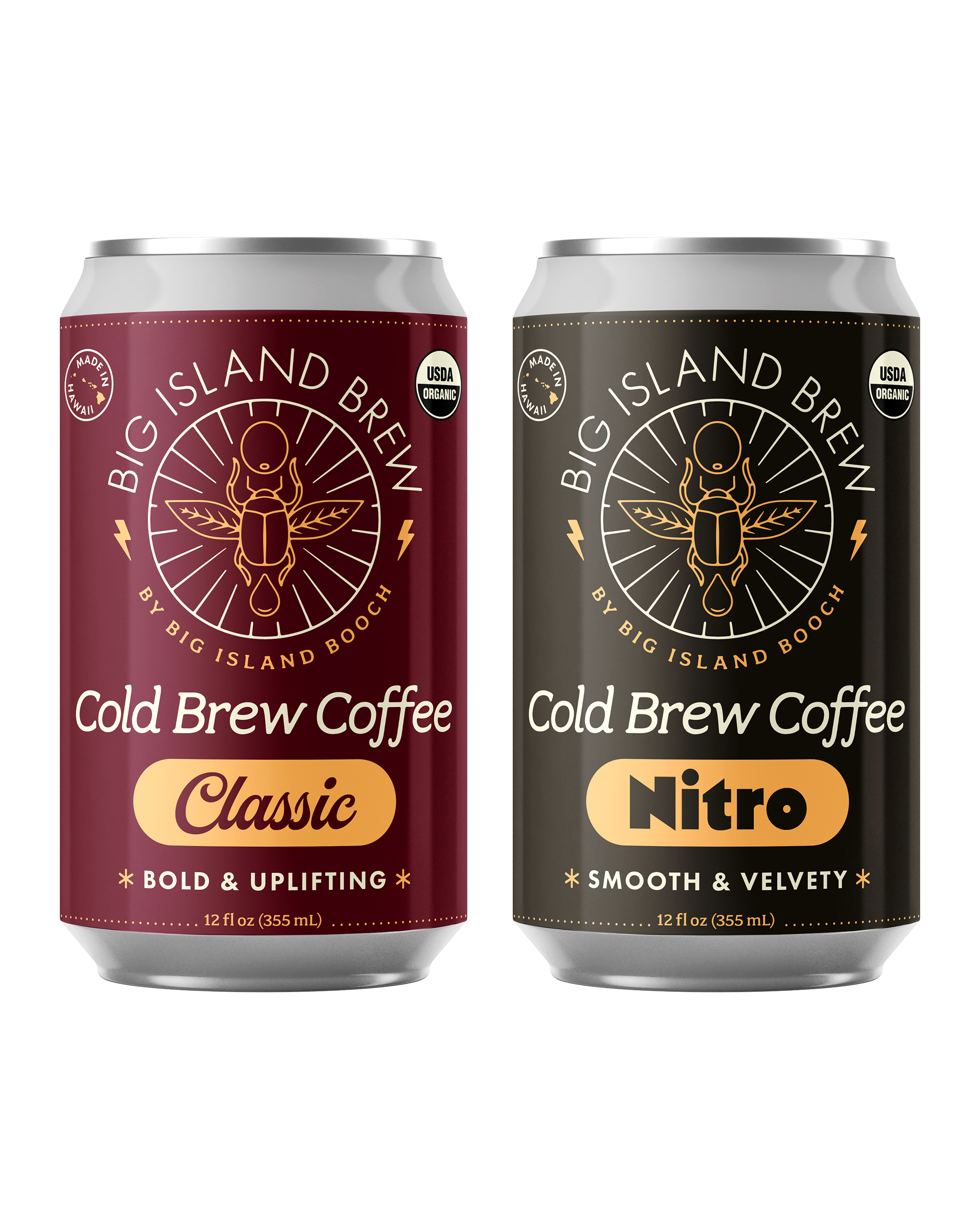
Big Island Brew Cold Brew Coffees (2025)
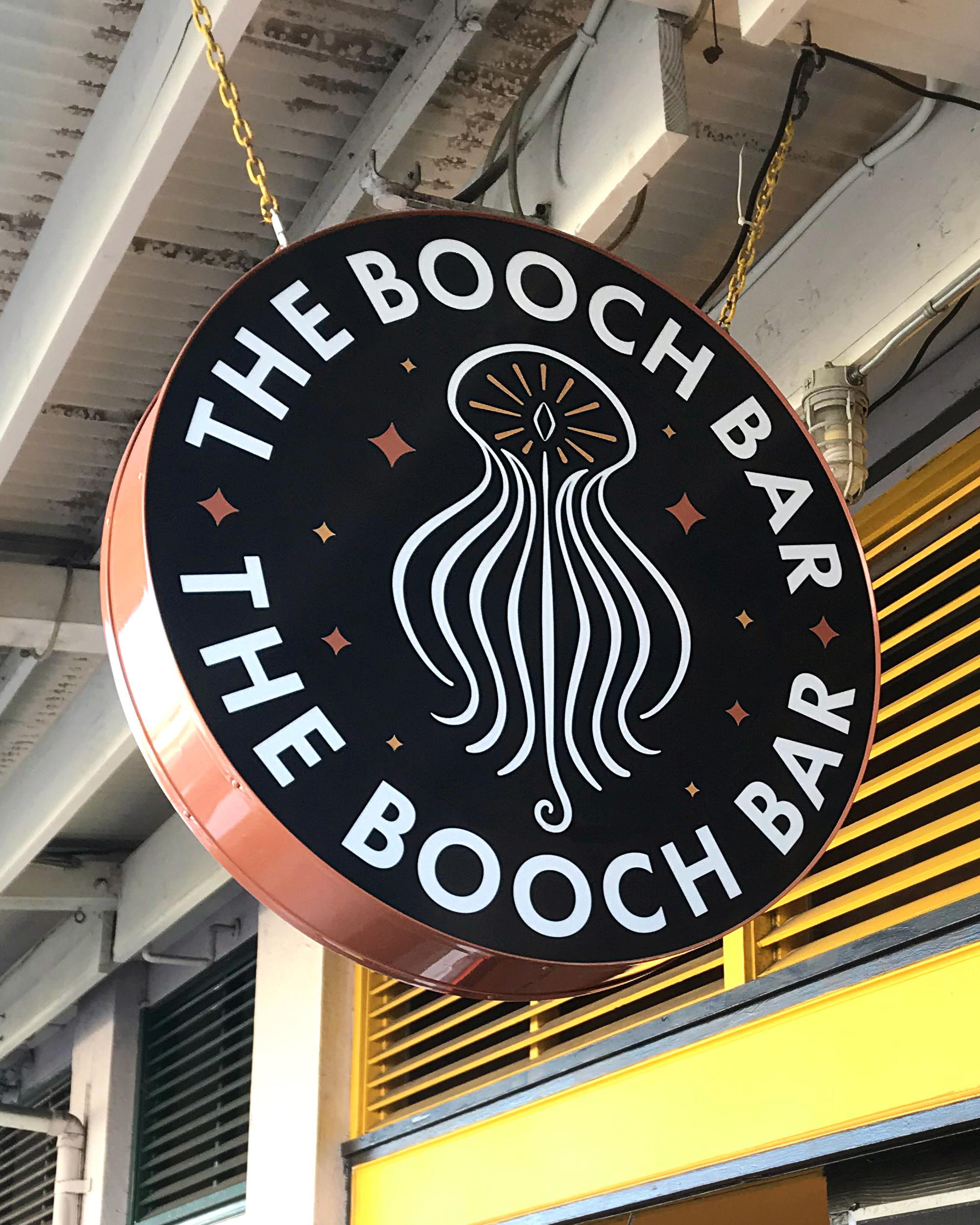
BIB Booch Bar lighted hanging sign (2022)
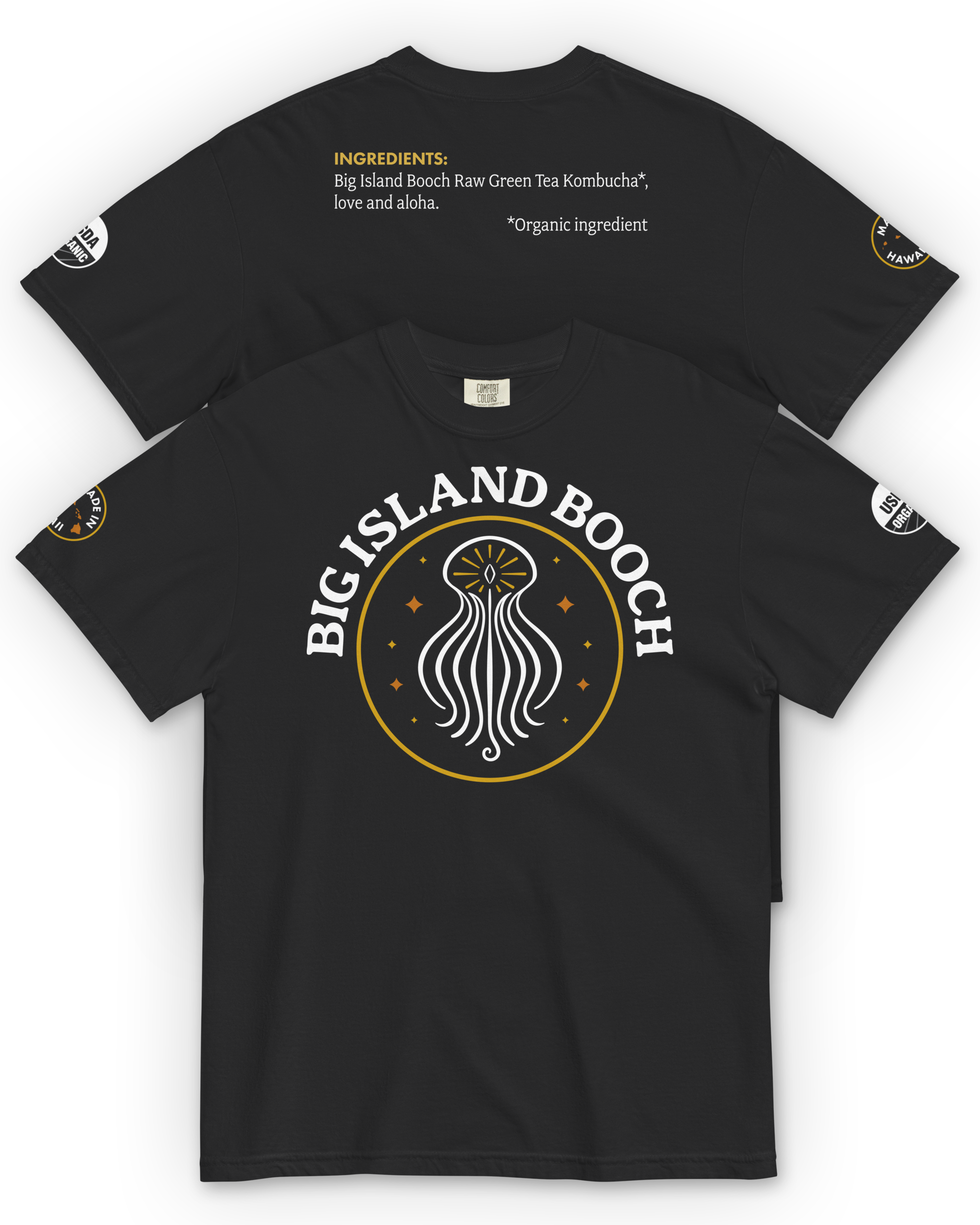
Big Island Booch t-shirt (2025)
Big Island Booch glassware (2025)
“After the first label with Ryan, it was like the company now was able to compete on a larger stage.”
Results and Impact
Based on client-reported outcomes and documented distribution milestones.
• Client-reported revenue approximately doubled within one year of the initial rebrand
• Has become the #1 kombucha brand in Hawaii
• Expanded distribution statewide across multiple islands
• Secured placement in Costco Hawaii across multiple product formats
• Increased production capacity through acquisition of adjacent warehouse space
• Successfully launched a sister brand, Big Island Brew
• Sustained demand leading to multiple packaging refreshes and seasonal releases
“Ryan has created a recognizable theme that is prominent throughout our brands and has really become the thread tying all of our creations together. People love our branding and after this last update, I think we might go all the way to the moon!”
Before and After
Original logo (2013 – 2016)
Current logo (2025)
Original bottle (2013 – 2016)
Current logo (2025)
Client Feedback
Throughout the partnership, the Big Island Booch owners consistently emphasized the strength of the design work, collaborative process, and long-term effectiveness of the brand system.
“Ryan has such a good eye for a catching design. His work is beautiful, vibrant, and clean, and we love the way he incorporates the things we ask for. Every direction he brings us looks great, and his eye for design is so special. We appreciate the ease of working together, his confidence under tight deadlines, and the attentiveness he brings to every project.”
—Kela Cosgrave, co-owner
Big Island Booch Kombucha
Conclusion
The Big Island Booch partnership demonstrates the long-term value of strategic brand design supported by consistent creative direction. What began as a local favorite evolved into a statewide leader with a distinctive visual identity strong enough to compete alongside national brands—without losing its roots or sense of place.
The brand continues to evolve through new products, formats, and environments, supported by a system designed to grow rather than reset.